
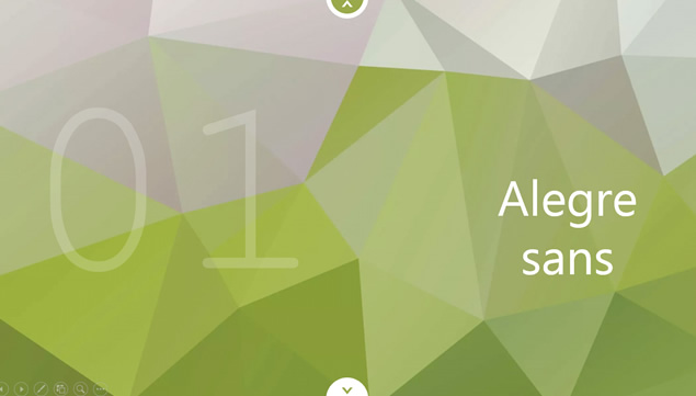
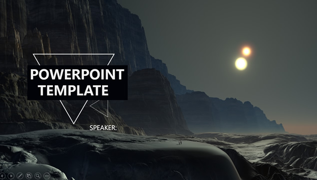
css3的随机背景图片淡入淡出切换特效 演示效果如本篇文章背景所示
看大家扒我的幻想领域二次元限定版扒的比较累,扒了大半个小时的,抽空整理一下发出来
设计之初本来是打算使用jQuery进行实现的,但是注意到了css3的@keyframes 规则,css3已经强大到曾经只有js才能实现的效果
定义和用法
通过 @keyframes 规则,您能够创建动画。
创建动画的原理是,将一套 CSS 样式逐渐变化为另一套样式。
在动画过程中,您能够多次改变这套 CSS 样式。
以百分比来规定改变发生的时间,或者通过关键词 "from" 和 "to",等价于 0% 和 100%。
0% 是动画的开始时间,100% 动画的结束时间。
为了获得最佳的浏览器支持,您应该始终定义 0% 和 100% 选择器。
注释:请使用动画属性来控制动画的外观,同时将动画与选择器绑定。
核心css部分(记得切换图片地址)
body {
background: #000;
background-attachment: fixed;
word-wrap: break-word;
-webkit-background-size: cover;
-moz-background-size: cover;
background-size: cover;
background-repeat: no-repeat
}

ul {
list-style: none
}

.cb-slideshow li:nth-child(1) span {
background-image: url(https://qqqq.com/1.jpg)
}

.cb-slideshow li:nth-child(2) span {
background-image: url(https://qqqq.com/1.jpg)
}

.cb-slideshow li:nth-child(3) span {
background-image: url(https://qqqq.com/1.jpg)
}

.cb-slideshow li:nth-child(4) span {
background-image: url(https://qqqq.com/1.jpg)
}

.cb-slideshow li:nth-child(5) span {
background-image: url(https://qqqq.com/1.jpg)
}

.cb-slideshow li:nth-child(6) span {
background-image: url(https://qqqq.com/1.jpg)
}

.cb-slideshow,.cb-slideshow:after {
position: fixed;
width: 100%;
height: 100%;
top: 0;
left: 0;
z-index: -2
}

.cb-slideshow:after {
content: ''
}

.cb-slideshow li span {
width: 100%;
height: 100%;
position: absolute;
top: 0;
left: 0;
color: transparent;
background-size: cover;
background-position: 50% 50%;
background-repeat: none;
opacity: 0;
z-index: -2;
-webkit-backface-visibility: hidden;
-webkit-animation: imageAnimation 36s linear infinite 0s;
-moz-animation: imageAnimation 36s linear infinite 0s;
-o-animation: imageAnimation 36s linear infinite 0s;
-ms-animation: imageAnimation 36s linear infinite 0s;
animation: imageAnimation 36s linear infinite 0s
}

.cb-slideshow li:nth-child(2) span {
-webkit-animation-delay: 6s;
-moz-animation-delay: 6s;
-o-animation-delay: 6s;
-ms-animation-delay: 6s;
animation-delay: 6s
}

.cb-slideshow li:nth-child(3) span {
-webkit-animation-delay: 12s;
-moz-animation-delay: 12s;
-o-animation-delay: 12s;
-ms-animation-delay: 12s;
animation-delay: 12s
}

.cb-slideshow li:nth-child(4) span {
-webkit-animation-delay: 18s;
-moz-animation-delay: 18s;
-o-animation-delay: 18s;
-ms-animation-delay: 18s;
animation-delay: 18s
}

.cb-slideshow li:nth-child(5) span {
-webkit-animation-delay: 24s;
-moz-animation-delay: 24s;
-o-animation-delay: 24s;
-ms-animation-delay: 24s;
animation-delay: 24s
}

.cb-slideshow li:nth-child(6) span {
-webkit-animation-delay: 30s;
-moz-animation-delay: 30s;
-o-animation-delay: 30s;
-ms-animation-delay: 30s;
animation-delay: 30s
}

@-webkit-keyframes imageAnimation {
0% {
opacity: 0;
-webkit-animation-timing-function: ease-in
}

8% {
opacity: 1;
-webkit-transform: scale(1.05);
-webkit-animation-timing-function: ease-out
}

17% {
opacity: 1;
-webkit-transform: scale(1.1) rotate(0)
}

25% {
opacity: 0;
-webkit-transform: scale(1.1) rotate(0)
}

100% {
opacity: 0
}
}
当然还是需要配合HTML代码的
HTML部分(其中的文字部分和<li>的数量是可以随意更改的)
<ul class="cb-slideshow"><li>
<span>幻想</span></li>
<li>
<span>领域</span></li>
<li>
<span>一个</span></li>
<li>
<span>专业的</span></li>
<li>
<span>二次元</span></li>
<li>
<span>图床</span></li>
</ul>
注意:<li>的数量要和css对应上,并且至少要两个以上。另外ie浏览器是不支持CSS3的特效
<br/>
<br/>

1、本站提供的源码不保证资源的完整性以及安全性,不附带任何技术服务!
2、本站提供的模板、软件工具等其他资源,均不包含技术服务,请大家谅解!
3、本站提供的资源仅供下载者参考学习,请勿用于任何商业用途,请24小时内删除!
4、如需商用,请购买正版,由于未及时购买正版发生的侵权行为,与本站无关。
5、本站部分资源存放于百度网盘或其他网盘中,请提前注册好百度网盘账号,下载安装百度网盘客户端或其他网盘客户端进行下载;
6、本站部分资源文件是经压缩后的,请下载后安装解压软件,推荐使用WinRAR和7-Zip解压软件。
7、如果本站提供的资源侵犯到了您的权益,请邮件联系: 11210980@qq.com 进行处理!
本文地址:https://www.zycang.com/115384.html
文章转载或复制请以超链接形式并注明来源出处。 本文最后更新于:2023-07-06 21:26:41
声明:某些文章或资源具有时效性,若有 错误 或 所需下载资源 已失效,请联系客服QQ:11210980


![[亲测可用]InfixBiz 4.1开心版- 带有 POS 的企业管理 ERP系统-资源仓库](https://www.zycang.com/wp-content/uploads/2023/08/4c9240a760df.png)


请登录后发表评论
注册